Table of content
- Frequency Polygon
- Graph of Frequency Polygons
- Statistics Using Frequency Polygon
- Example of a Frequency Polygon
- Frequency polygon and what is histogram ?
Frequency Polygon
A line segment connecting the midpoints of the top rectangles in a histogram curve results in a frequency polygon. It is created using histographing. By connecting the midpoint of the top of the rectangle in a histogram, a frequency polygon may be created as a graphic representation of the data. It is a visual representation of the data that is used to analyse massive amounts of data for a specific purpose.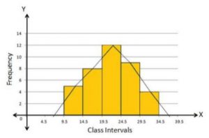
Graph of Frequency Polygons
A line connecting the top corners of the rectangles in a histogram to depict the centre of the frequency polygon, which is a visual representation of data. It is plotted on the x-axis, while the y-axis displays how many times each category has been repeated. You must accurately mark the class interval, or midpoint, when plotting a frequency polygon graph. It can be quickly drawn after creating a histogram or without one as well. In order to create a frequency polygon using a histogram, rectangular bars must first be drawn in opposition to the class intervals. The midpoints of the bars are then joined to create the frequency polygons. The actions that must be taken in order to draw a frequency polygon are mentioned below.- The first step in creating frequency polygons is to create a histogram.
- Next, select the class interval and indicate the values on the graph's horizontal axes.
- Put a marker in the middle of each interval on the horizontal axes that is represented by a rectangle.
- Put the class's frequency on the graph's vertical axes.
- Mark the midpoint of the class interval in accordance with the frequency of each class interval.
- Use the line segment to connect each of these points.
- For the given data, the resulting representation is a frequency polygon.
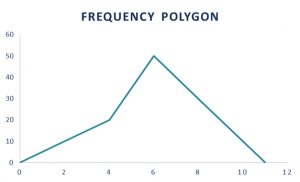
Frequency polygon graph
Statistics Using Frequency Polygon
To represent data in statistics, a graph or other figures are employed. The midpoint of the top of rectangular bars in each interval or bin are joined by a frequency polygon, which is a graphic representation of the data.Example of a Frequency Polygon
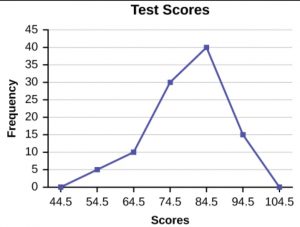
Below is a solved example of a frequency polygon for the benefit of the students.Construct a frequency polygon using the data given below:
| Test Scores | Frequency |
| 49.5-59.5 | 5 |
| 59.5-69.5 | 10 |
| 69.5-79.5 | 30 |
| 79.5-89.5 | 40 |
| 89.5-99.5 | 15 |
Solution: Firstly, we first need to calculate the cumulated frequency from the frequency given.
| Test Scores | Frequency | Cumulative Frequency |
| 49.5-59.5 | 5 | 5 |
| 59.5-69.5 | 10 | 15 |
| 69.5-79.5 | 30 | 45 |
| 79.5-89.5 | 40 | 85 |
| 89.5-99.5 | 15 | 100 |
The class grades of 54.5, 64.5, 74.5, and so forth up to 94.5 are now plotted. To begin and terminate the polygon, we will also plot the preceding and following class marks, or 44.5 and 104.5.
Then, each class mark is plotted against the frequency associated with that class. This makes sense because class marks 44.5 and 104.5 have zero frequency and contact the x-axis, as seen in the picture below. The main purpose of these highlighted points is to give the polygon a closed shape. The frequency polygon then appears as follows:
Frequency polygon and what is histogram ?
A frequency polygon represents data graphically by connecting the midpoints of each interval or bin with lines, while A graph that depicts the relative frequency or probability density of a single variable is called a histogram. Below is a description of how a frequency polygon differs from a histogram.- A histogram is a group of contiguous rectangles, whereas a frequency polygon is a line graph.
- A histogram is a two-dimensional figure, whereas a frequency polygon has multiple dimensions.
- A frequency polygon can be plotted along with a number of frequency distributions. For each distribution in a histogram, however, we must create a different graph.
- Since a frequency polygon is a continuous curve, it is simple to ascertain whether or not charge estimates are present. With a histogram, it is not feasible.
Define a frequency polygon.

Source: Safalta.com
A frequency polygon is a pictorial depiction of the given data made by joining the midpoints of the top of rectangular bars.
Is a frequency polygon and histogram similar?
No, it’s not similar but has some similarities. The major difference between them is the histogram is a graphical representation of data using adjacent rectangles while a frequency polygon is a curve obtained by joining the midpoint of that rectangles.


